Economic Functions Visualization
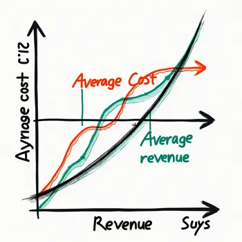
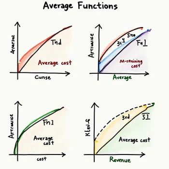
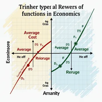
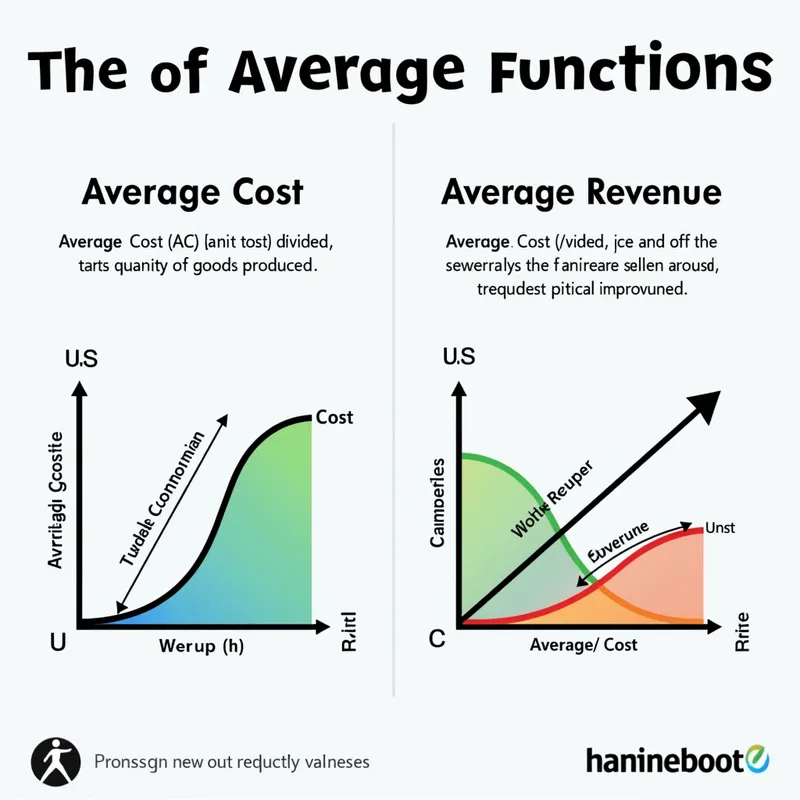
An infographic-style image depicting various types of average functions in economics. The image features graphical representations of Average Cost (AC) and Average Revenue (AR). The Average Cost graph shows the total cost divided by the quantity of goods produced, represented as a U-shaped curve to illustrate economies and diseconomies of scale. The Average Revenue graph is a linear upward-sloping line that demonstrates the revenue per unit sold, typically representing price. Both graphs are color-coded, labeled, and positioned side by side to provide a clear comparison and understanding of their behavior in economic analysis.
Photorealistic 2, Size: 1024 x 1024
2 Likes
104 Views