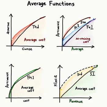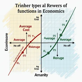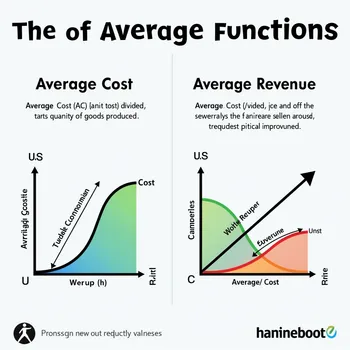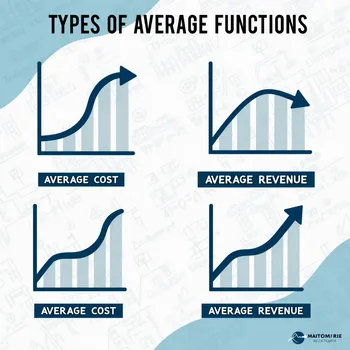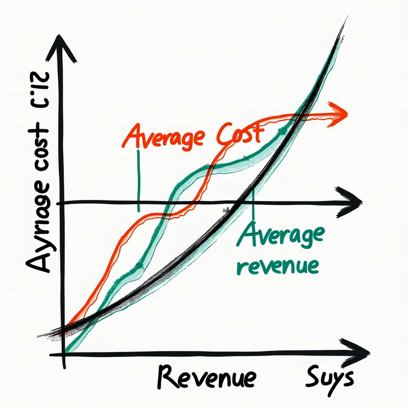
Economics Graphs of Average Functions
A detailed and colorful graphical representation of average functions in economics, specifically illustrating average cost and average revenue. The image should include smooth curves and labels clearly distinguishing between the two functions. The x-axis represents quantity produced or sold, while the y-axis represents cost and revenue in monetary terms. Use arrows to indicate the trends of both average cost and average revenue.
Photorealistic 2, Size: 1024 x 1024
3 Likes
102 Views